
Graphs are a powerful tool for presenting data in a visually engaging way. However, not all graphs are created equal. In fact, bad graphs can mislead, confuse, or even distort the information they aim to convey. Whether you’re presenting data in a business meeting, writing a research paper, or creating content for a website, it’s crucial to understand what makes a graph “bad” and how to avoid common pitfalls. This article will delve into the different types of bad graphs, explain why they fail, and offer tips for creating effective and accurate graphs that truly reflect the data.
What Are Bad Graphs?

A bad graph fails to communicate information clearly and accurately. Whether due to poor design choices, misleading scales, or unnecessary complexity, these graphs can confuse viewers and lead to incorrect interpretations of data. Sometimes, bad graphs hide the truth or make data look more dramatic than it really is. They can be the result of oversight or intentional manipulation.
The main issue with bad graphs is that they mislead the audience into drawing the wrong conclusions. A good graph should provide clarity, make the data easier to understand, and highlight key insights. Bad graphs, on the other hand, do the opposite by creating confusion or offering a distorted view of the facts.
Common Types of Bad Graphs
Understanding the common types of bad graphs is the first step toward improving data visualization. Here are some of the most frequent offenders:
- The 3D Pie Chart
Pie charts are often used to show proportions, but when designed poorly, they can lead to confusion. A 3D pie chart might seem visually appealing, but it distorts the size of the sections. The three-dimensional effect makes it difficult to compare the sizes of the slices accurately, leading to poor interpretation.
Why it’s terrible:
- Distorted perspectives make it hard to judge the actual proportions.
- 3D effects can hide smaller sections, making them harder to see.
- The Misleading Bar Graph
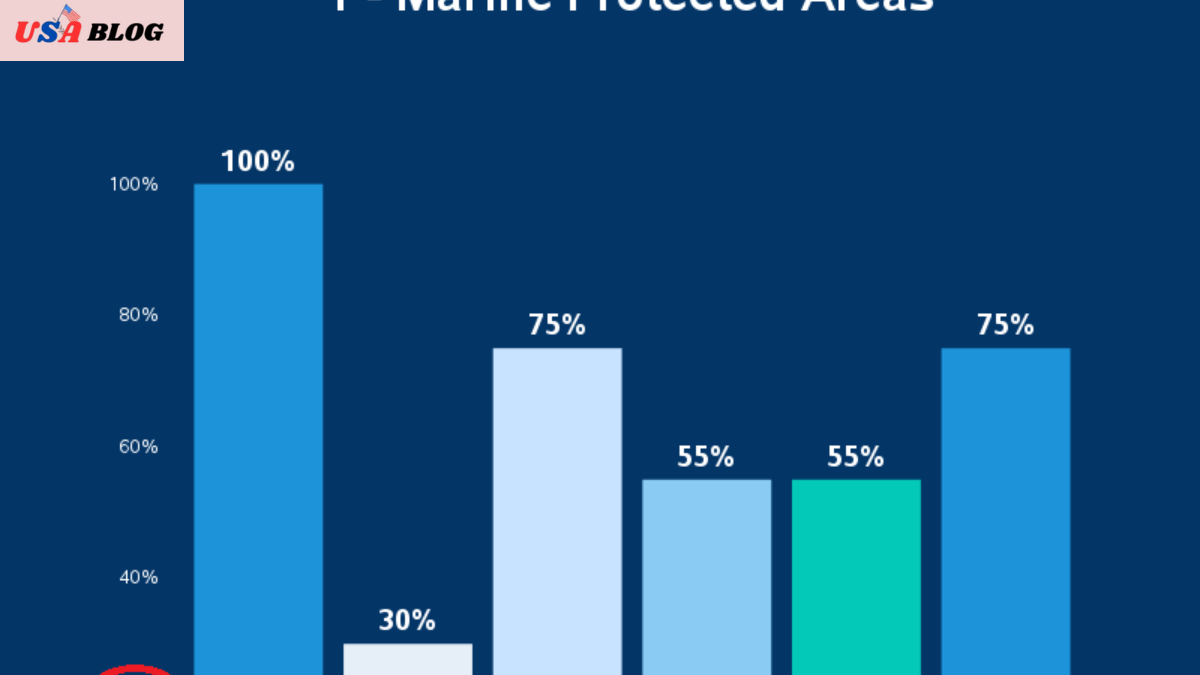
Bar graphs are great for comparing different categories, but a misleading bar graph can lead viewers to misapprehend the data. This can happen when the axes are not scaled correctly or when the bars are exaggerated.
Why it’s bad:
- Inconsistent axis scaling can make differences between categories seem larger or smaller than they actually are.
- A bar that’s too long or short can mislead viewers about the magnitude of the data.
- The Overcomplicated Line Graph
While line graphs are used to show trends over time, an overcomplicated line graph with too many lines can confuse the viewer. When there are too many data points, or the lines overlap too much, it becomes hard to follow the trend.
Why it’s bad:
- Too many lines make it impossible to distinguish between them.
- Viewers may get overwhelmed and miss key insights.
- The Inconsistent Scale Graph
An inconsistent scale graph happens when the graph’s axes are not proportionally scaled. This can make slight differences in data appear massive or vice versa. Using non-uniform intervals along the y-axis, for example, can trick viewers into thinking a trend is steeper than it is.
Why it’s bad:
- It manipulates the viewer’s perception of the data.
- It can make trends seem dramatic or trivial, depending on how the scale is set.
- The Too-Colorful Graph
While colors are helpful in making graphs more visually appealing, using too many colors makes a graph more challenging to read. Overuse of color can make it hard to differentiate between categories or distract from the data’s core message.
Why it’s terrible:
- Overuse of colors can make the graph visually overwhelming.
- It can be hard to interpret which color represents which data category.
Why Bad Graphs Matter
Using bad graphs can have significant consequences, especially in business, education, and scientific research. The most crucial reason to avoid bad graphs is that they can distort the message you’re trying to communicate. Here are some reasons why bad graphs matter:
- Misinformation: Bad graphs can mislead people, causing them to draw false conclusions about the data. This can be particularly harmful in settings like healthcare, public policy, and education.
- Confusion: Poorly designed graphs can confuse viewers, making it harder to interpret the data accurately. This can lead to misunderstandings and wasted time as people try to make sense of the graph.
- Credibility Loss: Presenting bad graphs can damage your credibility. If your audience sees that you’re using misleading or unclear graphs, they might question the accuracy of the data you’re presenting.
Key Elements of Good Graphs
Now that we understand what makes a bad graph let’s discuss the key elements that make a good graph. A well-designed graph should:
Clear and Simple Design
The graph should be easy to read and understand at a glance. Avoid unnecessary embellishments that distract from the data. Keep the design clean, simple, and free of clutter.
Accurate Representation
Ensure that the graph accurately represents the data. Avoid manipulating the scales, and make sure that the size of the bars, pie slices, or lines reflects the true magnitude of the data.
Proper Labeling
Each axis should be clearly labeled, and the units should be mentioned. Use a title that explains the graph’s purpose, and include a legend if there are multiple categories or data series.
Consistent Scales
Make sure that the scales on both axes are consistent. This helps ensure that the relationships between data points are represented proportionally and fairly.
How to Fix a Bad Graph
Fixing a bad graph requires identifying its flaws and making adjustments that improve clarity and accuracy. Here are some steps you can take to fix common graph issues:
Fixing a 3D Pie Chart
Switch to a 2D pie chart instead of a 3D one. This makes it easier to compare the size of each slice directly. Also, use colors that contrast nicely to ensure that all sections are clearly visible.
Fixing a Misleading Bar Graph
Make sure that the bars are proportional and that the axes are scaled appropriately. Avoid distorting the graph by starting the y-axis at a value other than zero, as this can exaggerate differences between the categories.
Fixing an Overcomplicated Line Graph
If there are too many lines, consider simplifying the graph by reducing the number of data series or breaking it into smaller parts. Different line styles (dashed, dotted, etc.) can help distinguish between the lines.
Fixing an Inconsistent Scale Graph
Check the intervals on your axes and ensure they are consistent. A linear scale on the y-axis is usually best, but a logarithmic scale may be more appropriate in cases where exponential growth is involved.
Best Practices for Creating Graphs
To ensure that your graphs are effective, here are some best practices to follow:
- Choose the right type of graph: Different types of data are best represented by different types of graphs. For example, use line graphs for trends over time, bar graphs for comparisons, and pie charts for proportions.
- Use clear, legible fonts: Make sure the text is easy to read. Avoid fonts that are too small or difficult to decipher.
- Limit the number of categories: Too many categories can overwhelm the viewer. Stick to the most critical data points.
- Label everything: Every axis, category, and data point should be clearly labeled to avoid confusion.
Example of a Bad Graph vs. a Good Graph
Here’s a simple example of how a bad graph can be transformed into a good one:
Bad Graph
A 3D pie chart with distorted slices, unnecessary colors, and no labels.
Good Graph
A 2D pie chart with clear, proportional slices, contrasting colors, and properly labeled sections.
AspectBad GraphGood Graph
Chart Type 3D Pie Chart 2D Pie Chart
Labels Missing labels on slices Clear labels on each slice
Color Usage Overuse of colors, making it hard to read Limited, contrasting colors for clarity
Clarity Distorted and hard to interpret Simple and easy to understand
Final Thoughts: The Impact of Bad Graphs
In conclusion, bad graphs can seriously hinder your ability to communicate data effectively. Whether you’re working on a business presentation, a research project, or an educational assignment, it’s crucial to understand how to avoid bad graphs. By paying attention to design elements, ensuring accuracy, and following best practices, you can create graphs that genuinely reflect the data and help your audience draw the correct conclusions.
Next time you’re tasked with creating a graph, remember: a clear, simple, and accurate graph will always do a better job of conveying your message than a complex, misleading one. Avoid the pitfalls of bad graphs, and you’ll have a powerful tool to communicate data effectively.